8-9 min read
This is the full version of the case study. View the condensed version here.


YEAR
2024
TIMELINE
6 months
TOOLS
Figma
Maze
PLATFORM
iOS
INDUSTRY
Productivity
TEAM
1 Designer, 2 Engineers
Overview.
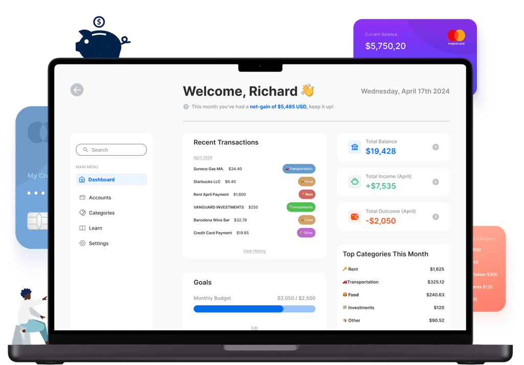
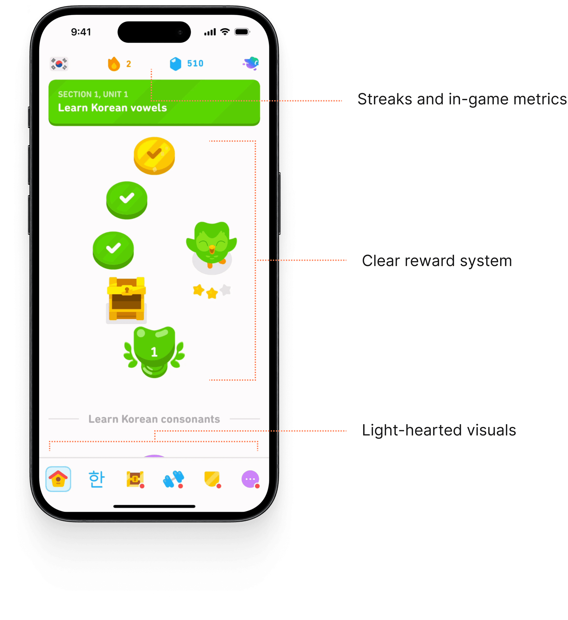
"Seeds" marries New Year Resolutions with consistency. Most of it was done at a hackathon, but I continued polishing it after. With design, I improved the task completion rate from 75 to 95%.
With more time, I would've also focused on growth and retention metrics (MAU, CRR, etc.) to better understand the typical user lifecycle and inform future design choices accordingly.
The End-Product.
Challenges
There was opportunity to capitalize on the interaction design of the project, but it was met with pushback from development.
Time was also a constraint; the team was assigned two days for this project as it was completed at a hackathon. However, I continued to polish it afterwards as it became a passion project.
How I Overcame Them
I overcame this by prioritizing screens that would be key to creating communal resolutions and recording progress. I took this direction as a result of discussing product direction with my team, with the idea that sharing work early and often would ensure that we'd be goal and constraint-aligned.
VIDEO
Users can create a group-effort to complete their resolutions together.
THE PROBLEM
Effort for sticking with New Year's Resolutions falls off a cliff.
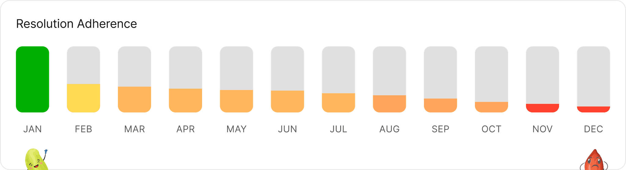
The numbers behind this.
This data was collected via academic and other secondary sources. Hover the statistics to see.
Why did so few people succeed?
Where did people feel friction early-on?
We hypothesized why this may happen.
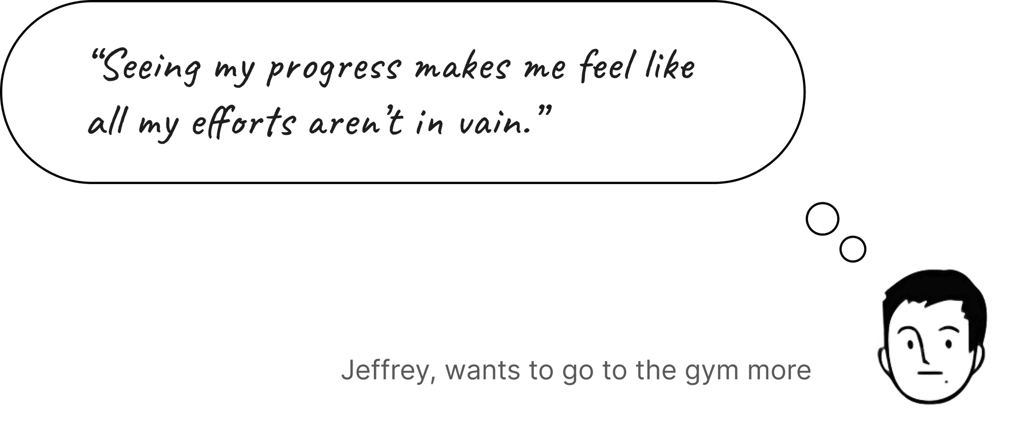
The team and I shared our experiences, as well as those of our peers. From going to the gym more often to eating healthier, there was a consistent theme for why sticking with resolutions is difficult:
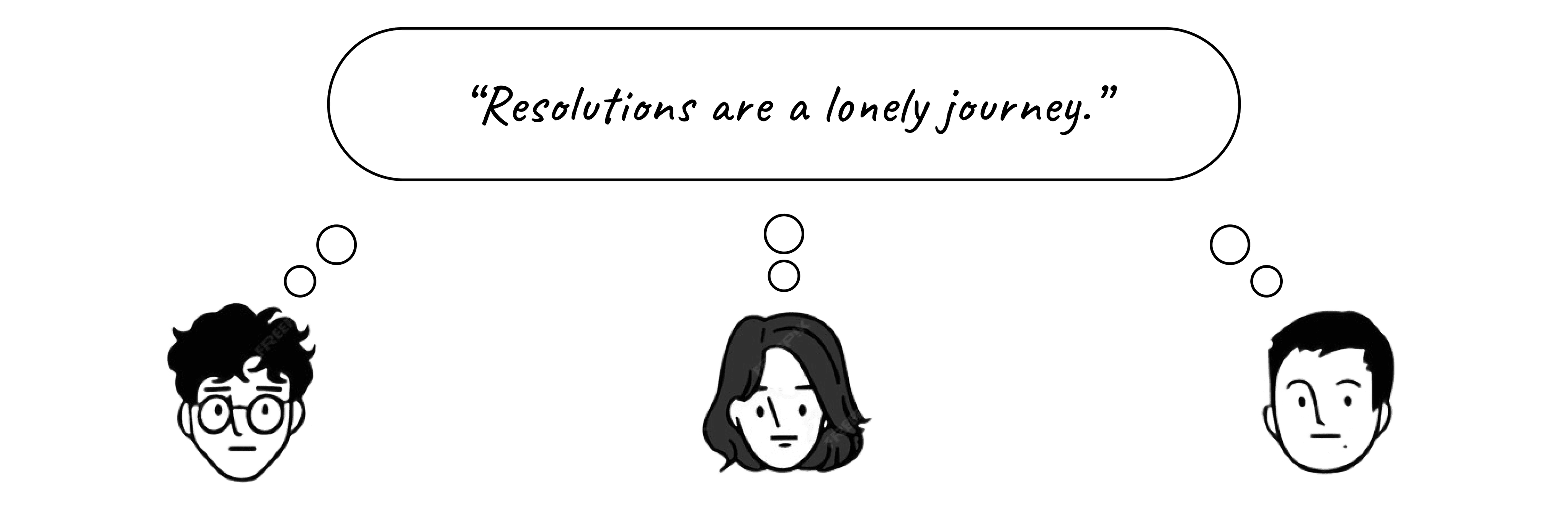
This prompted our north star question:
How might we make resolutions more engaging and less lonely?

Why are we designing this?

Who will use this?
When and Where?
What are some ideas?

Prioritizing

Impact and Success
RESEARCH: THE "HOOKED" MODEL
There are four core parts to habit-forming products.
The core pillars.
I was solving a people-problem at its core. As a result, I leveraged habit-forming book, "Indistractable" by Nir Eyal to add scientific merit to my design decisions.
Trigger
Stimuli that spur us to do something.
Action
What drives users to engage.
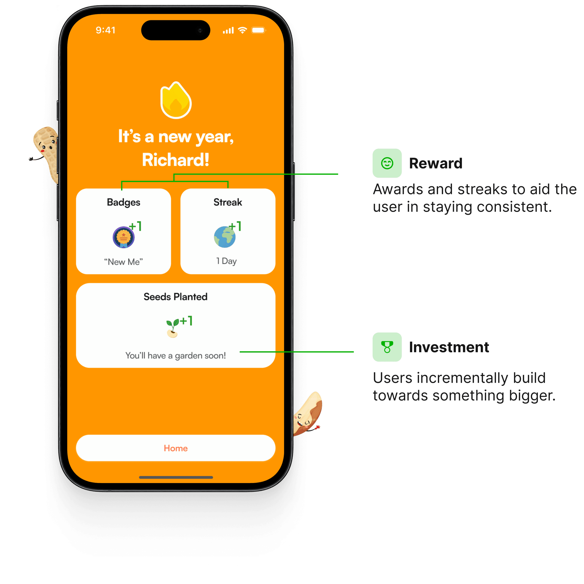
Reward
What aids in helping the user stick to using the product.
Investment
Total time and effort contributed, also known as "stored value".
So… what's the competition doing?
I looked at competitors in the self-growth space: Not so Boring Habits (Apple Design Award '22 Winner) and Duolingo (37 million MAU) to identify areas that contributed to user and business success.

My core insight was that these apps:
Mix gamification and relaxed visual design to encourage users to return.

IDEATION AND PRIORITIZING
I prioritized: feasibility, user-satisfaction and time.
These criteria were determined through discussion with my engineering team.
Brainstorming together.
The criteria for narrowing down which ideas to proceed with was determined through discussion with my engineering team.
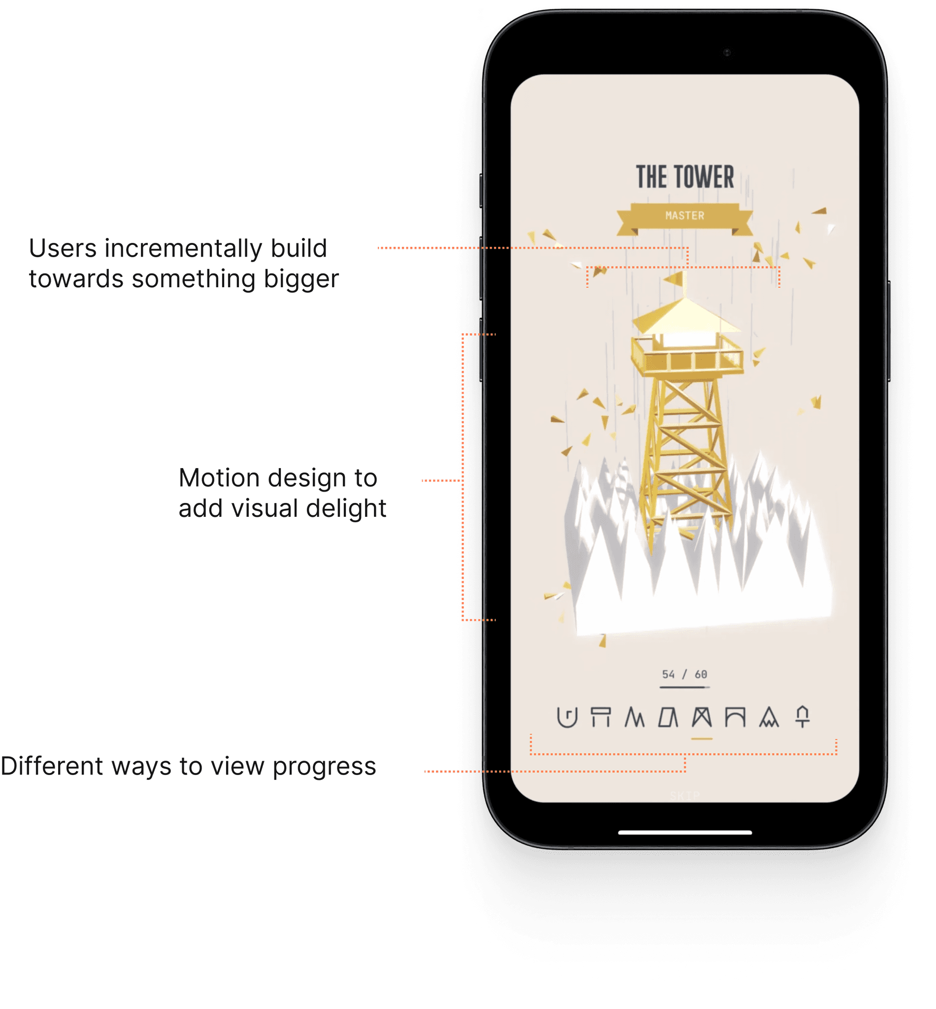
Opt 1: View past months/progress history
Engineering Effort
User-satisfaction
Time
Rationale
We thought about different ways to be able to view resolution progress, such as growing the seeds we plant, but it had to be feasible to develop.
Opt 2: Incentivized Badging
Engineering Effort
User-satisfaction
Time
Rationale
Badges are commonplace in the self-growth space, but are secondary rather than being a primary motivator for change.
Opt 3: Live Accountability Sessions
Engineering Effort
User-satisfaction
Time
Rationale
Live-accountability calls weren't super practical. With differing resolutions calls for different settings and conditions to be completed in.
Opt 4: Add Friends for Group Gamification
Engineering Effort
User-satisfaction
Time
Rationale
Group Gamification best adheres to the hooked model, while also being more technically feasible than the other proposed ideas. This idea won!
EARLY SKETCHING
Experimenting with the home screen
We wanted the home screen to have the look and feel of a social platform to reduce adoption friction.
Adding Friends
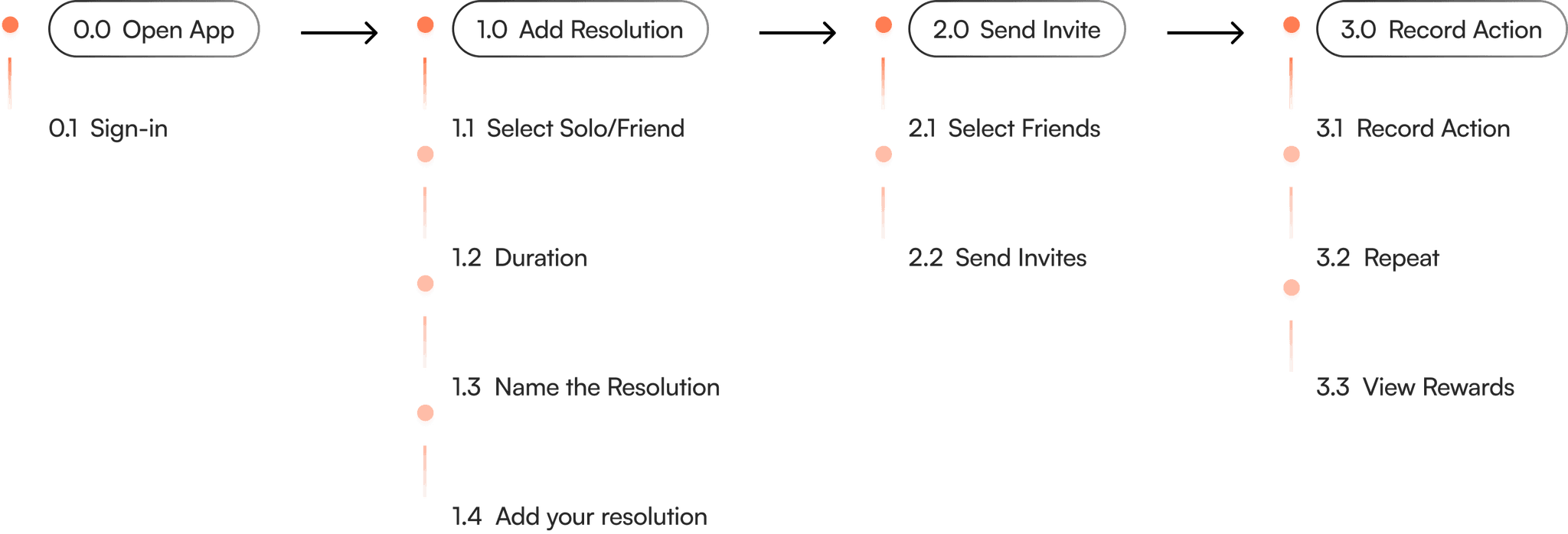
How could we make resolutions fun and engaging through team-building? A group-effort.
Recording Check-Ins
I took a look at other habit-tracking apps to analyze how to lower interaction costs for future users.


and the winner is…
When discussing with engineering, we felt that a flow surrounding a social feed and a low interaction cost feature would best adhere to the Hooked model.
The Rationale
Users will plant "seeds", or resolutions that they seek to accomplish. These resolutions can be completed either solo or together.
The Opportunity
Completing goals via group effort is a strong opportunity to leverage the Hooked model and showcase tangible progress (growing oneself).
THE FOUR PILLARS
Tying it all back together.


Setting up Effective Triggers
A social feed with other friends serves as an internal trigger to stay up-to-date with what others are doing. Internal triggers are the root cause of forming habits.
Making Actions Low-Friction
The action of creating a challenge/resolution is low-friction, along with recording its completion. A trigger or prompt would help to promote this as well.
Rewarding Users
Self: Intrinsic rewards and signs of encouragement are rewards for ourselves.
External: Others reacting to completed resolutions satisfies social desire (likes, comments, approval)
Expanding on User Investment
Planted seeds could be expanded upon to add another layer to the gamification aspect.

The first version was ready to be tested.
End-users would be asked to create a resolution, invite their friends and record daily completion. The key metric that I would be evaluating would be task completion rate: how intuitive would this foundational flow seem?

USER TESTING
What would end-users think?
I tested the product with 15 end-users (people who've previously set resolutions). With more time, I would've liked to also focus on growth and retention metrics (MAU, CRR, etc.)
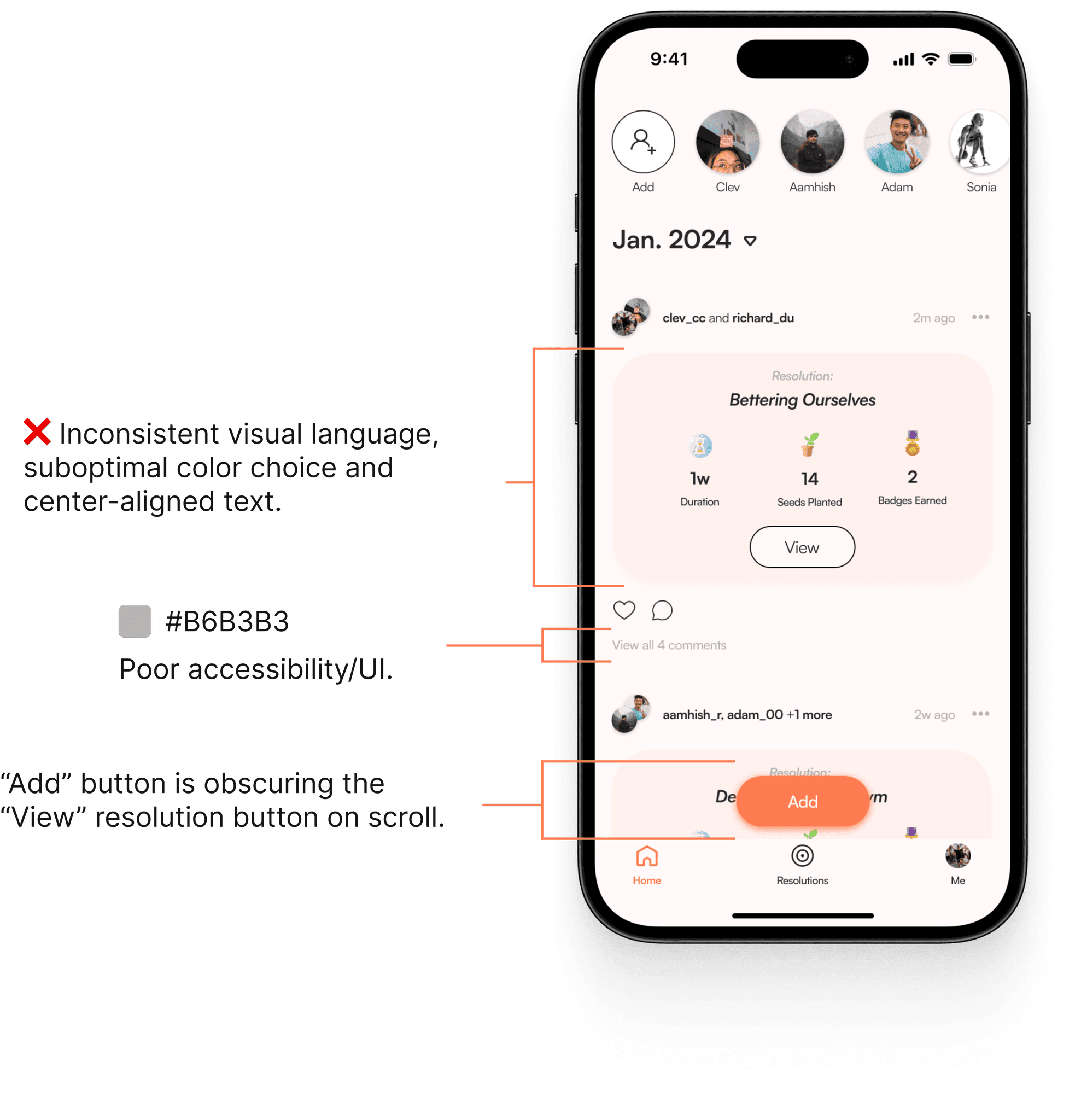
Initial testing revealed some areas for improvement. One user said:
"There's a lot of competing elements on the home screen.”
Another participant said:
“The color choices are confusing me, it feels inconsistent.”
How would we gauge success?
Completing a resolution would be the heartbeat of the product; I wanted to gauge how seamless this was while finding where users felt friction.
75% of users completed the task
Most users were able to create a group resolution, send out invites and record daily completion of the task.
Hearing from end-users
I was solving for a people-problem. How inclined would users feel to continue with their resolutions after use?
CHALLENGE: DESIGN PUSHBACK
It wasn't just sunshine and rainbows.
We faced a challenge: how might we further illustrate progress?
I wanted to animate a virtual garden of progress where users could see their seeds being grown to signify growth. However, this idea faced pushback from engineering, as it wouldn't be feasible to develop given the time constraint.
Speaking the same language of engineering was key here, and we mutually pivoted to prioritize the insights from user research. We wanted to have something more tangible to test, rather than focusing on a "What if?".
CHALLENGE: DESIGN PUSHBACK
But we faced feasibility issues on some ideas.
I was inspired by the idea of marrying progress-based visuals with gamification to enhance the interaction design. I mentioned the idea of animating task completion to the developers to see what they'd think.
They agreed that it would be great from a UI standpoint, but it wasn't feasible provided the time constraint, so this idea didn't end up making it onto the final cut. I agreed with them.
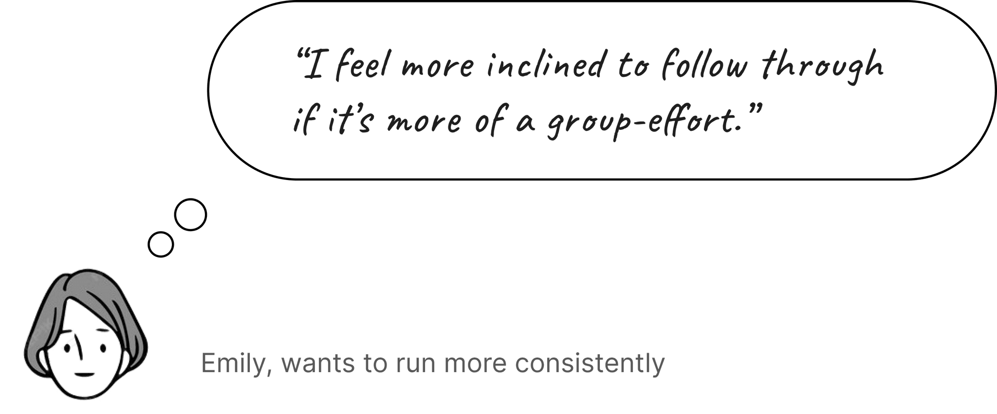
Community is huge when it comes to sticking with our goals. Just think of running clubs on Strava or language clubs on Duolingo.
I thought of creating a chat feature so that friends can communicate their progress for the challenge.
But when we weighed the impact vs. time constraint, we as a team felt that we should allocate more time to the resolution-creation process.

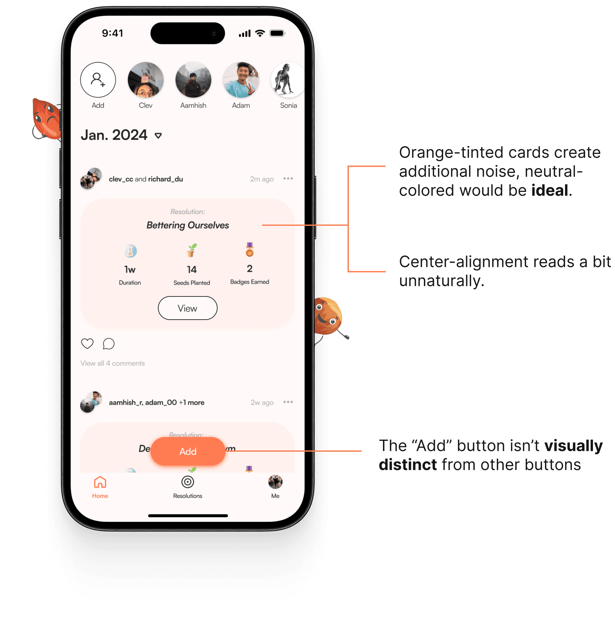
Making heuristic changes.
To improve the app's heuristics, I leveraged feedback to iterate on the resolution cards and creation-button placement. Per WCAG guidelines, I improved the overall accessibility, made consistent the visual language and pushed the UI closer towards design best-practices.

Polishing up the visual design elements.
The end product was more visually refined, with iterations having been made to the home screen, resolution-creation flow and completion screens.

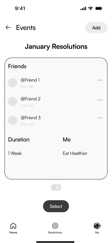
V1 — Creation Details.
1.0
User Confusion
Users were overwhelmed by the amount of information they had to input. Because of this, it led a few to drop-off from the task before completion.
2.0
Confusing button styling
The selection buttons were the same style as the CTA button. This contributed to poor visual hierarchy.

V2 — Improved Creation Heuristics.
1.0
Step Clarity
I decided to progressively disclose information needed on the user end to prevent drop-off, while adding a progress indicator to improve the affordance.
2.0
Clear selection options
Much clearer visually with distinguished button styling, along with a simpler type-hierarchy that feels more systematic.
MEASURING IMPACT
Our resolutions—done together.
What did people think?
We initially set out to solve a "people" problem, so I wanted to also gauge how well this product might be received by end-users.
Assemble your squad.
Impact
+25%
Task Completion Rate
User Satisfaction
VIDEO
Building a group-effort.
VIDEO
Recording completion of a resolution.
TAKEAWAYS
Design and engineering are constantly in a dance of product-tango.
Compromise. It's key.
There was opportunity to capitalize on the interaction aspect of the project, but it was met with pushback from development.
Results are better than "What If?"
Driving results is the north star. At times, you have to pivot and prioritize what moves the bottomline.
Be a good partner.
To enable more efficient design-developer workflows, familiarizing myself with HTML and CSS would be a nice next step to take.