BudgetBuddy
Boosting early adult confidence in finance management by 33%
YEAR
2025
TIMELINE
5 months
TOOLS
Figma

Trello

Maze
PLATFORM
Web
INDUSTRY
Fintech
TEAM
1 Designer, 2 Engineers, 1 Product Manager
OVERVIEW
BudgetBuddy demystifies finance management for early adults.
BudgetBuddy is a desktop platform for improving financial literacy. Features offered include, daily trivia on common financial topics and visualized expense budgeting via expense syncing.
I worked on this project with a Product Manager and Engineers, increasing user confidence for finance management by 33% (prev. 55%).
VIDEO
Users syncing spending information

IMG
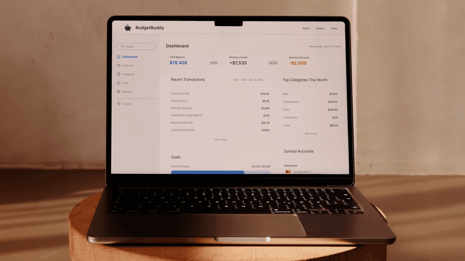
User dashboard screen
PROBLEM
Financial illiteracy is an issue that affects millions.
Why are we designing this?
In the U.S., the average adult spends ~$1,497/month on nonessential items, totaling roughly $18,000 annually.
RESEARCH
People find finances confusing and overwhelming.
I worked with Product to survey 25 people and interview 10 on their personal pain points in seeking to become more financially literate. There were some core themes, namely:
Taking control of and managing finances is both intimidating and overwhelming.
People didn't know where to get started in wanting to learn more about their finances.
Reducing unnecessary spending was a common challenge for many interviewees.
Analyzing competitors.
I wanted to identify gaps within the current fintech market. Budgeting is common, but looking at popular apps indicated that there was a clear gap:

ALIGNMENT
Balancing product goals with constraints.
I led design workshops with engineering and product to ensure that we'd be goal and constraint-aligned in brainstorming ideas. The three core features we moved forward with were: Account syncing, daily trivia and a consolidated resource library.

ACCOUNT SYNCING
Enabling adults to quickly understand their financial standing.
My goal here was to simplify things: make information digestible, give clear next steps, and use approachable visuals to build confidence rather than create an information-dense experience. I reframed financial management not as something intimidating or high-stakes, but as something early adults can ease into and feel good about as they go.
VIDEO
Users syncing spending information
CHALLENGE
Navigating an unexpected wrench in our workflow.
I faced an abrupt challenge of losing one of our two engineers due to unexpected circumstances. For me, it meant there'd be more of a limit to what we could eventually design and ship. I worked with my PM to help refine our scope and work on simplifying flows and just focus on identifying the core value.

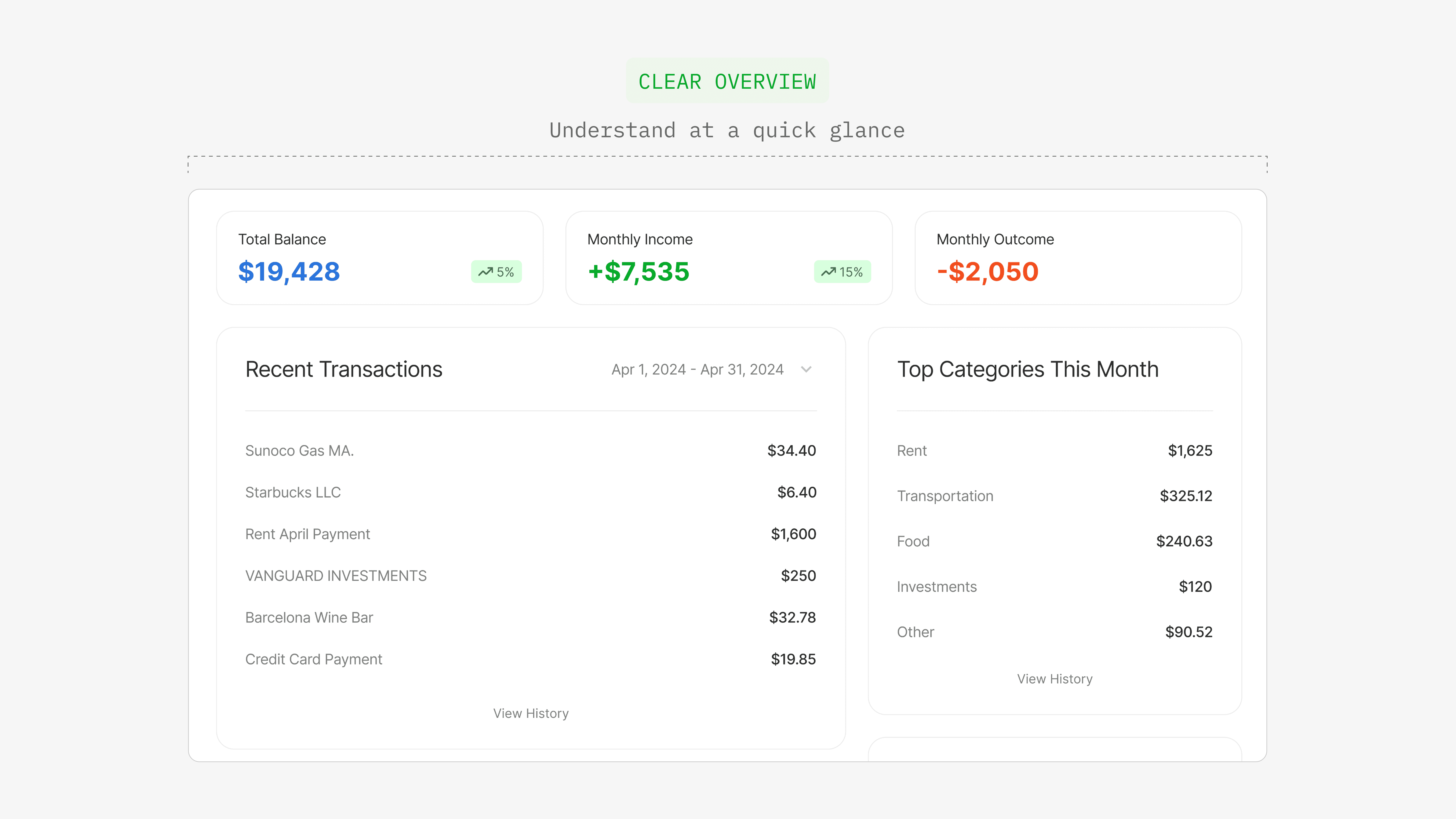
Polishing the dashboard.
The dashboard focused on clarity to build confidence. A cleaner visual hierarchy helped to focus on content presentation and made it easier for users to understand where they stood financially at a glance.
IMG
Dashboard Design
Improving the existing form design.
In the new form design, I opted for a more segmented button-style that clearly indicates the options that users have. This was also more beneficial to engineering because we now had fewer edge cases and states to manage, and the behavior of each component would be much more predictable.

IMG
Account-syncing form
DAILY TRIVIA
Addressing intimidation.
Each topic would contain two daily trivia questions to test fundamental knowledge, with a chance to earn badges. Trivia is meant to be a low-friction way of addressing the themes of intimidation and overwhelm for users.
VIDEO
Users completing trivia
RESOURCE LIBRARY
Consolidating key information under one roof.
Finances are full of jargon—terms like “APR” and “index funds” often alienate users and contribute to intimidation. I created an on-demand support system to help users feel more confident and independent in their learning journey.

IMG
Consolidated resource library
CHALLENGE
Operating as the lone design authority in the room.
One of the biggest challenges that I faced for this project was navigating as the lone designer. To address this, there were two core points that I put into practice:
Leverage your cross-functional partners as much you can. I would say, if you have the bandwidth, be embedded within the processes and workflows of your teammates.
Being the lone designer calls for maximum efficiency, so ensuring that all design decisions are rooted in data, ideally both quant and qual, is a strong starting point.
IMPACT
Focusing on the human condition — how did we do?
A survey was administered to users prior to using BudgetBuddy and after. The goal was to address the "human" pain point of feeling intimidated by managing finances.
Findings showed that there was a +33% user confidence (prev. 55%) in managing their finances moving forward.

When it came to gauging success, and because we were solving for a "human" problem, product and I wanted to better understand the confidence difference users felt in managing their finances prior to and after using BudgetBuddy.
TAKEAWAYS
Advocate, but speak the same product language as your teammates.
Data is the building block for themes and solutions. Leverage qualitative and quantitative data to build informed hypotheses.
Go through every interaction design with the thought of, "What happens if a user does something unexpected?". Think like an engineer.